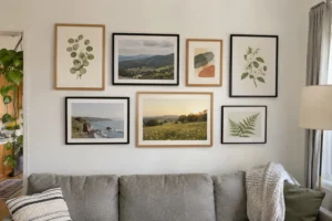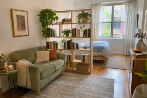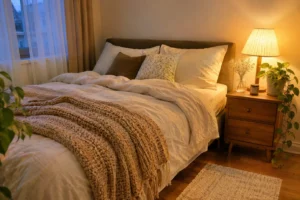

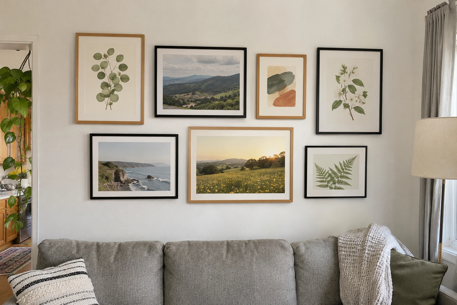
A gallery wall can be the most personal part of a room or a scatter of frames that never quite line up. I’d argue the difference has very little to do with the art. It comes down to choosing one layout, keeping the spacing consistent and planning everything before you make a single hole. These gallery wall ideas walk you through all three.
We’ll cover picking a layout, choosing frames and art, spacing everything correctly and hanging it without stress. The measurements are designers’ rules of thumb, so adjust them to your wall and your eye.
Choose one layout style
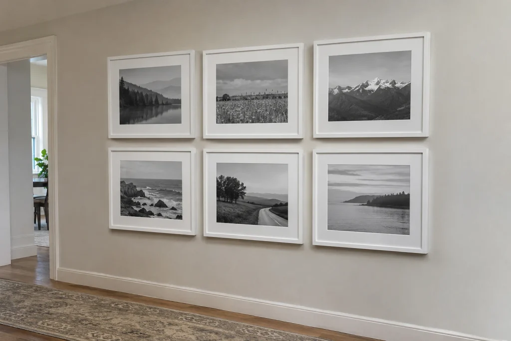
If it’s your first gallery wall, I’d go with a grid; it’s the hardest to get wrong. Most gallery walls fall into one of these styles. Picking one before you start makes every other decision easier.
| Layout | What it looks like | Best for |
|---|---|---|
| Grid | Same-size frames in even rows and columns | Calm, modern rooms; a set of prints or photos |
| Salon style | Mixed sizes and shapes clustered together | Eclectic collections and frames you already own |
| Center anchor | One large piece with smaller ones around it | A favorite artwork you want to stand out |
| Picture ledge | Frames leaning on one or two narrow shelves | Renters and anyone who likes to change art often |
| Staircase | Frames following the angle of the stairs | Stairwells and long hallways |
Pick a common thread
A gallery wall looks curated when the pieces share something. Choose at least one thread to hold everything together:
- Frame color: all black, all white, all natural wood, or two finishes at most.
- Art color: a palette such as black-and-white photos, or art that repeats the colors of your sofa and cushions.
- Theme: botanical prints, travel photos, family photos or children’s drawings.
If your frames are mismatched, consistent mats, such as white mats inside every frame, can pull them together.
Get the size and height right
The overall arrangement should relate to what’s below it. Above a sofa, bed or sideboard, aim for the whole gallery to be about two-thirds of the furniture’s width, with the bottom row 8 to 10 inches (20 to 25 cm) above the furniture. On an empty wall, center the arrangement at about 57 to 60 inches (145 to 152 cm) from the floor, which is roughly eye level for most adults.
Mixing a few standard frame sizes makes planning easier. A common salon-style mix uses one or two large frames, such as 16×20 in (40×50 cm), several medium 11×14 in (28×35 cm) frames and a few small 5×7 in (13×18 cm) or 8×10 in (20×25 cm) frames. Standard sizes also make it easy to find mats and to replace art later.
On a staircase, keep the center of each frame roughly 57 to 60 inches above the stair directly below it, so the gallery follows the slope of the stairs.
Keep the spacing consistent
Even spacing is what makes a gallery wall look intentional. Leave about 2 to 3 inches (5 to 8 cm) between frames. Closer spacing makes a tight, modern look; wider spacing feels more relaxed. Whatever you choose, keep it the same throughout, and keep the outer edges of the arrangement roughly straight even if the frames inside vary.
For salon-style walls, start with your largest piece slightly off center, then build outward, balancing large and small pieces on each side.
Plan it on the floor, then on paper
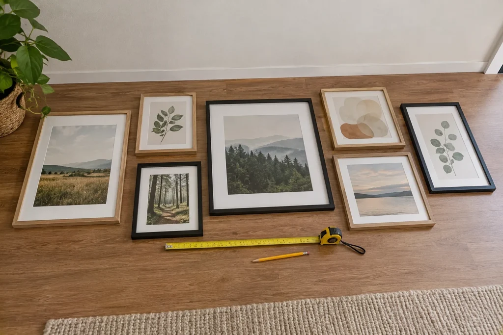
Please don’t skip this step. This step saves you from extra holes:
- Lay all the frames on the floor in front of the wall and arrange them until you like the layout. Take a photo.
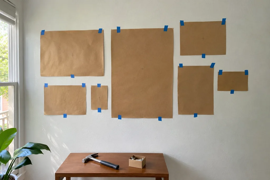
- Trace each frame onto kraft paper or newspaper and cut out the shapes.
- Mark where the hanging point falls on each paper shape by measuring the frame’s wire or hook.
- Tape the paper shapes to the wall with painter’s tape, using your photo as a guide.
- Live with the paper layout for a day, adjust, then hang each frame right through the marked point on the paper.
Hang frames securely
Use hardware that suits both the weight of each frame and your wall. Small angled picture hooks hold most light and medium frames in drywall. Heavier frames need wall anchors rated for the weight, or a screw into a stud. Adhesive strips can work for light frames on smooth painted walls, but they’re less reliable on textured walls or in humid rooms.
Use two hooks spaced apart on wider frames to keep them level. Avoid hanging glass-fronted frames directly above a bed or a crib. If you rent, check your lease before making holes, or use a picture ledge, which needs only two or three screws for an entire wall of art.
Fill it with art on any budget
Honestly, the most interesting gallery walls mix inexpensive prints with personal pieces. You don’t need expensive art. Affordable options include:
- Your own photos, printed at a photo lab.
- Postcards, greeting cards and museum shop prints.
- Printable art from independent artists, printed on heavy matte paper.
- Pressed flowers or leaves in floating glass frames.
- Fabric or wallpaper samples in frames.
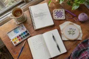
- Your own watercolors or sketches, even simple ones.
- Children’s artwork in matching frames.
Mix in one or two three-dimensional pieces, such as a small mirror, a woven plate or an embroidery hoop, to add depth.
Gallery wall ideas by room
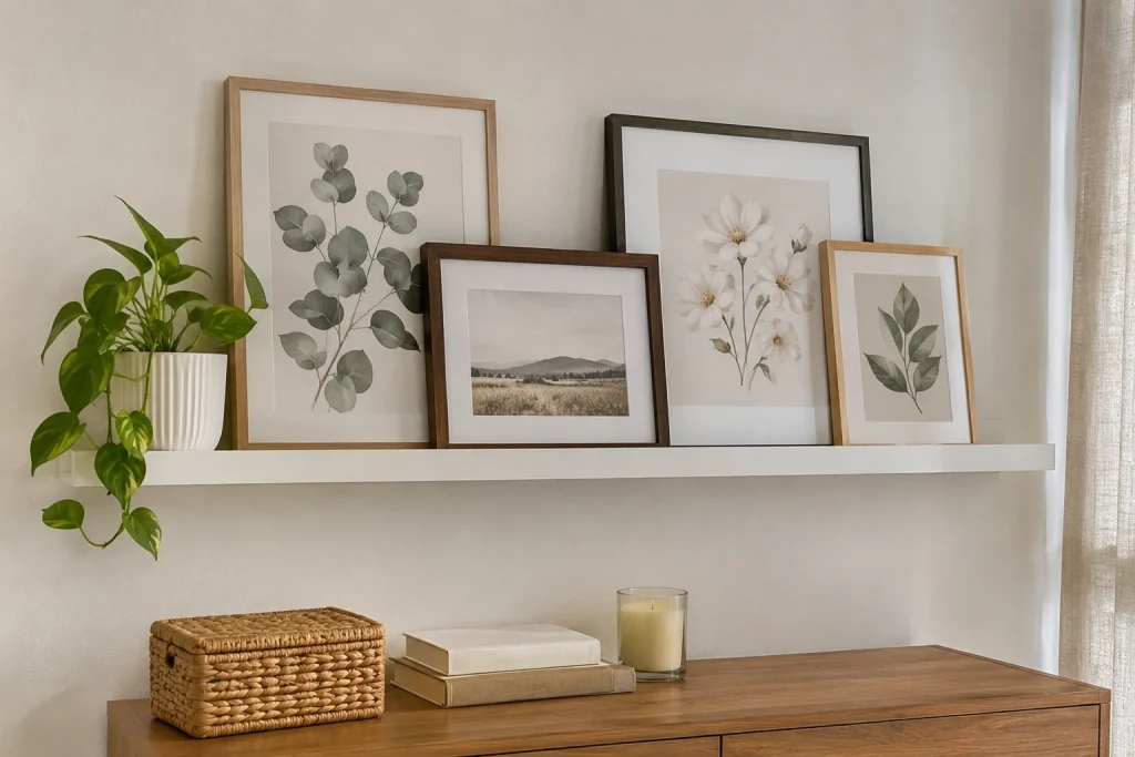
Different rooms suit different gallery walls:
- Living room: a salon-style or center-anchor wall above the sofa, with art that repeats the colors of your cushions or rug. This is where a larger gallery makes the most impact.
- Bedroom: a calm grid of three or six matching frames above the bed or dresser. Keep frames light, and favor lightweight acrylic fronts over glass above the bed.
- Hallway: a long, single row of same-size frames at eye level, or a picture ledge you can walk past without bumping into anything.
- Staircase: family photos in matching frames that follow the angle of the stairs.
- Kitchen or dining area: a few framed recipe cards, vintage food prints or small plates, kept away from the stove, where heat and grease can damage paper.
- Home office: a small grid of postcards or prints above the desk, changed whenever you need fresh inspiration.
A picture ledge is the most flexible option in any room. Frames simply lean on it, so you can overlap them, swap art with the seasons and try new arrangements without any new holes.
Common gallery wall mistakes
- Hanging too high. Art floating near the ceiling looks disconnected; bring it down toward the furniture.
- Too small for the wall. A few small frames on a big wall look lost. Add pieces or choose larger mats.
- Uneven gaps. Inconsistent spacing is more noticeable than mismatched frames.
- No anchor piece. Salon walls without a few larger pieces can look busy.
- Too many themes at once. Pick one thread and stick to it.
My one last tip: hang the center frame first and work outward. It keeps the whole arrangement anchored.
Looking for something to frame? Try creating a few pieces yourself with this watercolor guide for beginners, or add soft texture with this no-sew fabric wall art.